Composing Your Best Picture
Before starting, let me say that there are no hard and fast rules regarding composition. For every suggestion made here you can find innumerable examples of outstanding pictures that don't follow the rule.
If you are just starting out in photography, or looking to improve the quality of your shot, this is a great place to start! While these rules may be ignored individually with great results, I think you will be hard-pressed to find a great picture that doesn't conform to any of these guidelines.
By experimenting with these guidelines you will find some situations where the rules apply; other times when the rule doesn't seem to fit. The point is, that if you are aware of the principles involved then you can choose to ignore the principle. Your pictures will then be composed with a greater awareness of the elements that impact the viewer.The Basics
Photography takes a 3-dimensional scene and captures it in 2 dimensions. This has the tendency to flatten the view and change the way we perceive things in the image:
Simplicity Rules
Ask yourself "What is the subject?" You often have the ability to arrange either your subject or yourself in ways that tend to simplify the scene and keep your photos concentrated on the desired subject.
- If you have more than one subject, recompose your picture to concentrate on one of them.
- If the background is cluttered, remove the distractions or else move your angle of view so that the background is simpler. You can also make use of depth of field either when taking the picture or in post-processing to help reduce background clutter.
- Watch out for trees, signs and telephone poles that seem to emerge from your subject. Sometimes they can't be avoided, but it's easier to fix the problem before you take the picture!
- Keep water horizons and boats level!

Notice how this gentleman seems to have a telephone pole growing out of the top of his head.
When the camera compresses the image, it becomes difficult to differentiate between the background and the foreground. It is up to the photographer to avoid situations like this.Rule of Thirds
If you only get one thing out of this web site, let this be it!!!
There, is that enough of an attention-getter? Seriously, probably the most common mistake people make in taking pictures is not understanding the Rule of Thirds. It is truly amazing how much better your photography will get if you just remember this one rule!
Imagine dividing your picture into a tic-tac-toe pattern. The four intersecting lines are key points in your photo. By placing key aspects of your picture at these intersections you invite more interest into your composition. This leaves room in your picture to help tell the story you are trying to capture.
- If your subject is a human or animal, try arranging to have the eyes at one of the key intersections.
- If your subject is a person or object, strive to have a focal point at one of the key intersections.
- In a picture of scenery, try establishing the horizon at one of the horizontal divisions.
In your mind, divide your picture into thirds both horizontally and vertically, and position the key elements of your photo at those points.
Notice in this photo how the horizon is even with the top-third line, and the lone figure is very close to the junction of right and bottom third lines.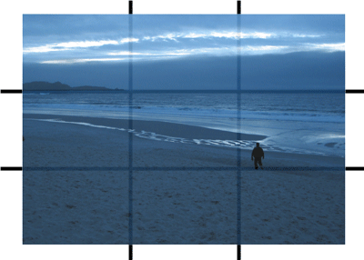
Practice framing your shots on the above photo.
Drag the camera into the picture and frame your shot as you would with a real camera.
Release the mouse button to view the results.
In this picture, the main subject is the central point, but somehow lacks something.
Notice how, simply by moving the focus to one of the imaginary dividing lines, the picture seems more satisfying.Fill the Frame
There is a psychological tendency to enlarge the object we are focusing on. In a photo this may result in the subject having too much unrelated space around it. By getting a little closer, you fill the frame with your subject and enhance the impact of that subject. You may discover a better picture by focusing on just a portion of the subject, thus filling the frame entirely with the larger subject to focus on a more interesting portion.
Notice how the subject seems far away and the picture is cluttered.
Filling the frame brings the subject right up to the viewer for a more detailed lookLighting
You could fill a book on the importance of lighting (in fact I'm sure someone has), but there are some simple things you can do to improve your pictures:
- Early morning and late afternoon are exceptional times for photography. The softer light brings a warmth to your pictures that may be missed in the harsher light of mid-day. The longer and softer shadows help add depth to your subject that can get lost when shadows are smaller and more pronounced.
- Brightly overcast days are nature's way of providing soft, diffuse lighting for the best pictures, free from the sun's glare and highly contrasting shade. Your subjects will look more natural as well, not having to squint in the face of bright sunshine.
- Use a flash if you have a bright, sunlit day where your subject may cast sharp shadows or perhaps even be in shadow. This fill-flash tends to lose some of the flavor of the ambient lighting in favor of smoothing the lighting of your subject.
This picture, taken in bright sunlight suffers from the hard shadows of mid-day.
The same picture, taken with fill-flash brings the subject into clearer focus.Intermediate Composition
Once you have covered the basics of composing your scene, it's time to consider the next step in enhancing your composition skills.
Vertical or Horizontal?
This choice can add a subtle, but important aspect to your picture. Your subject may naturally suit one view or another, but many times you may find that you may consider either framing. The choice you make will impact the viewer in several ways:
Vertical Horizontal Eye Scans Left to Right Top to Bottom Psychological Feeling Unstable Stable Emotional Content Precarious, Cramped Spacious
In this picture, the focus is primarily on the person, with the background being almost incidental.
Here you have the subject put in context of the surroundings. This takes some emphasis off of the main subject, but benefits from telling a larger story.Notice how these two photos convey a very different impression of the same scene
Frame the Subject
It is often possible to find natural ways of framing your subject that can add further interest to the picture or even change the feeling of the subject entirely.
Natural objects such as buildings, clouds, trees, awnings, windows, doors can provide an internal framing of the subject that both focuses on the subject and may also help set the stage.
In this picture, notice how the water jug and candle help to frame the subject.
Add Depth
Since pictures tend to flatten the scene, it may help to put your subject in context by incorporating some additional elements in the foreground or background.
- Adding an object in the foreground to a scenic shot or landscape can increase the interest of the scene.
- Including a person within the scene can help establish size.
- Pulling back from the object may reduce the feeling that the subject is 'hogging' the scene.
- Including some additional foreground or background may enhance the feeling of depth in your picture.
This image certainly fills the frame, and it's a lovely little waterfall, but we've lost the context of the shot.
By pulling back a little, we are able to see this focal point in a better context.Point of View
Most people take pictures at their eye-level. This seems quite natural, since that is the view from which we normally see the world. However, in photography, some of the more interesting pictures may be found when you change your view to something unusual. If you want to get an interesting perspective, try giving an 8-year old your camera to take a few shots. You will be very interested to see the world from an 8-year-old's point of view again!
- Bringing the camera's view to the level of your subject (for example a child or animal) helps add a comfortable immediacy to the scene.
- Raising the camera tends to emphasize the feeling of smallness. It may also serve to rise above a crowd or obtain some other elevated feeling.
- Lowering the camera tends to emphasize the size or height of the subject.
Bringing the camera down to eye level makes the subject more personalBalance
Balance is a matter of composing your picture in such a way that all the elements seem to achieve balance in their relationships. A large object on once side of the picture may be balanced on the other side with several smaller objects. A bit of color in one area may help to balance an otherwise empty space. Oftentimes you will find that the elements that go into making a picture seem balanced occur at the division of the picture into thirds.
Advanced Composition
Now your pictures are really taking off! Let's look at just a few more areas that can help you to take your pictures to the next level.
Consider the Flow
Consider how the person viewing your photo will approach it. For horizontally oriented pictures, the eye enters at bottom left and moves generally to the right and up; for vertically oriented pictures, the eye enters at the top left and moves generally to the right and down. You will want to compose your picture so that elements in the picture either tend to lead the eye to the subject or, in the case of the subject itself, stop the eye from moving beyond it.
- Action moving from left-to-right has a feeling of ease and rightness about it.
- Action moving from right-to-left may convey a feeling of wrongness or unease.
- The top-right corner for horizontal pictures and the bottom-right corner for vertical pictures should tend to be the least lit area. Avoid having this corner as the lightest area of the picture so that the picture will tend to keep the eye directed back toward the subject.
- Contain the wandering eye. Try to avoid lines that lead away from your subject to the right and out of the scene.
- Avoid large empty areas. They convey a sense of loneliness and tend to leave the picture unbalanced.
Lines Direct the Eye
The use of visible and implied lines help to direct the viewer towards areas of interest. Visible lines may consist of roads, fences, wires, shadows, and other visible objects in the picture and may contribute significantly to the emotional impact of the picture. Implied lines may consist of directions of movement, object placement, or orientation and may drive more intellectual interest.
- Try to find lines that lead the eye to the subject.
- Lines moving from the bottom-left to top-right lead the eye, ideally terminating in subject.
- Top-left to bottom-right lines tend to stop the eye. The line becomes the focus; the area beyond should not demand attention.
- S-curves lead the eye comfortably over a larger area of the picture.
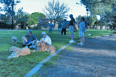
This picture demonstrates both kinds of lines.
You can see the physical curving concrete edge leading your eye towards the people.
But notice how the attention or orientation of the poeple in the photo draws your interest in the direction that they are looking.
Pity I couldn't include a good subject for them to be looking at but, hey! This is only for illustration, right!??Other Considerations
- Patterns can be used to draw attention, as can the breaking of a pattern.
- Color draws the eye.
- An odd number of objects may be more interesting. Try to have an odd number of identifiable objects to complete the story. If possible have at least two of the three objects oriented the same way or doing the same thing.
- Realize that different print sizes will trim different areas of the picture. For example, a 4x6 print will require trimming over 10% from the height of the photo, while an 8x10 print will need to trim about 6% from the sides.
A Checklist for Composition
Which orientation suits the subject best - Landscape / Portrait? Will altering my position or viewpoint help, e.g. a shot from above, below etc? Are there any intricate patterns to draw the attention? Can I make use of any natural lines to lead the viewer into the picture? Can I frame the photograph with something interesting? Will the use of a foreground object add impact? Is there a more interesting view of the subject from a different side? Will moving in closer cut out unnecessary clutter? If I fill the frame will it give a feeling of presence, action, power etc? Will isolating interesting parts of the subject help? Will the use of props (adding objects not originally in the scene) help? Can I make use of different lighting effects? A Quick Tip
Only show your best shots. Pros can take bad shots too, they just don't show them to anyone!
Further Information
Kodak.com has a various topics related to digital photography and taking great pictures.
fodors.com has a great area devoted to photographic composition.
American School of Paris provides basic guidelines for improving composition.
Wellington Photographic Society provides a short but excellent article on the composition of scenes for best effect.


